Kevin the Red

A concise account of how young Robert Fitzooth became Robin Hood illustrates why the tale fits so nicely into the KEVIN THE BOLD narrative, and in the October 31, 1965 episode, Robin’s antagonist is introduced—the Sheriff of Nottingham.

Traveling through Sherwood Forest, Robin and his band are confronted by a formidable obstacle. It is Little John, who Kreigh Collins summarily rechristens with a name more appropriate for his comic strip—and his resemblance to the strip’s titular character no doubt helped casual readers stay interested in the action. (Two years later, in another story arc, a blond version of Kevin would appear!)

Collins’ chief antagonist for the 15 years he had been illustrating KEVIN THE BOLD was the abridged third-page abominations found in so many of his syndicate’s newspapers. The NEA created third-page versions by severely cropping the left and right edges of the strip’s panels, but toward the end of 1965 Kreigh took a new approach—laying out the episodes so that that the entire third tier was expendable. Half pages included it; third pages did not.

Collins generally captured the most relevant parts of each episode in the upper two tiers, but in many cases, readers were missing out on some lovely bonus material.

_______________________________________________________________

For more information on the career of Kreigh Collins, visit his page on Facebook.

A Story of Robin Hood

As the 1960s progressed, several changes happened in regards to the production of KEVIN THE BOLD. In April, 1961, it sported a new logo, and for a couple years, Jay Heavilin took over the strip’s writing. By 1964, NEA Features Director Ernest Lynn had handed over supervision of the strip to NEA staffer Robert Molyneux. In 1965, the prevalence of newspapers running the dreaded one-third page format led to a brilliant new way of dealing with this unfortunate situation, and in another development, the name of the story arc occasionally started appeared in conjunction with the strip’s logo.

The first chapter to include this minor embellishment to the logo was “A Story of Robin Hood.”

On his way back from the New World settlement at Jamestown, Kevin begins recounting the tale of Robin Hood to Saigen, a young indigenous boy with whom he is traveling to England. Having an adult narrate a tale to a child was a device Kreigh Collins employed periodically, but Saigen’s appearance leads to some unfortunate stereotypes, language-wise. Looking beyond that, the reader sees a warm relationship between the two, as shown in the transitional episode from October 10.

Recounting the oft-told tale of Robin Hood could also be seen as a sign that original ideas for story arcs were beginning to dry up.

I’m not overly familiar with the story of Robin Hood—the last version I’ve seen was Mel Brooks’ Men in Tights—so perhaps I can benefit from a more traditional account, like learning how Robin and Marian were slated for an arranged marriage. Meanwhile, Robin is off to see the King.

Having been duped into killing the one of the King’s deer, the October 24 episode concludes with three ominous panels whose silence adds to the suspense.

To be continued…

_______________________________________________________________

For more information on the career of Kreigh Collins, visit his page on Facebook.

Late Themes

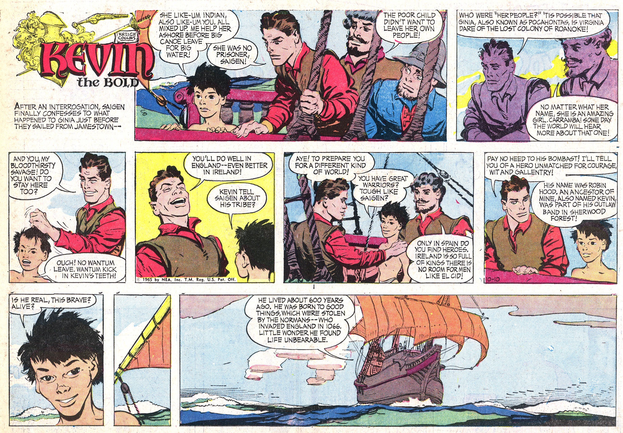
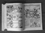
As they sailed away from the New World, Kevin began telling Saigen the story of Robin Hood. While having an adult narrate a story to a youth was a familiar trope for Collins, what was different was the appearance of the comic strip’s logo. A longbow and a quiver of arrows replaced the usual rapier and pistol, Robin Hood’s hat rested on the suit of armor’s helmet, and a chapter heading of sorts, “A Story of Robin Hood” was inscribed at the top.

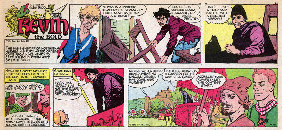
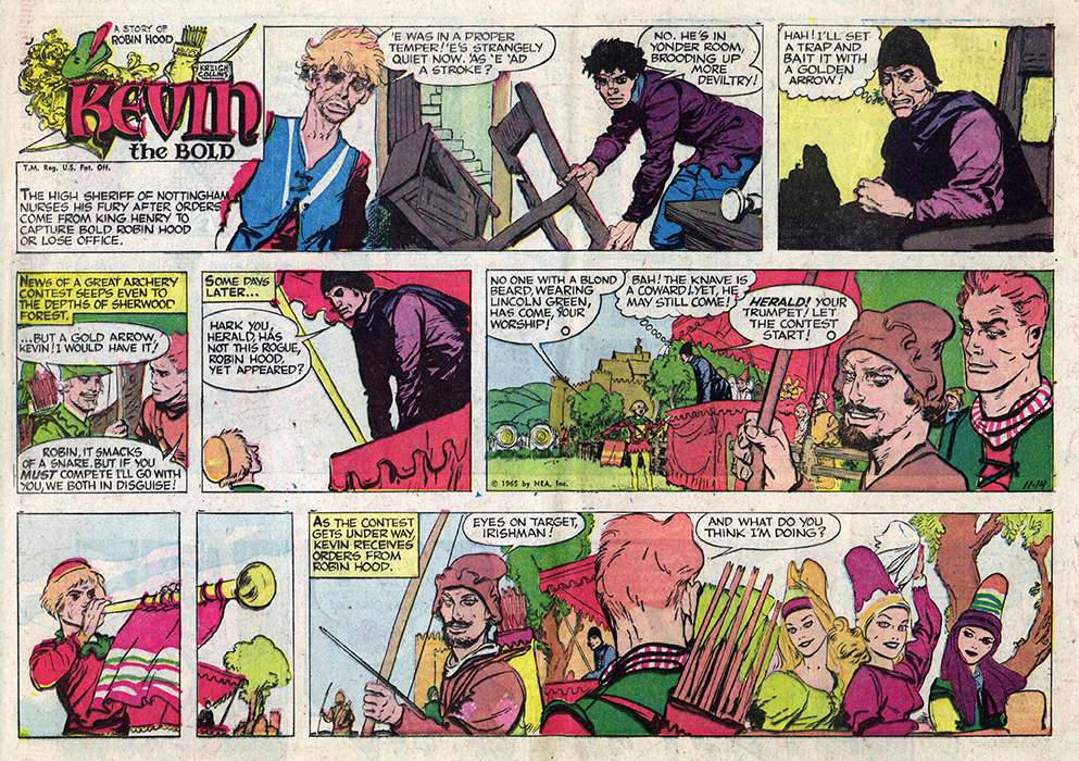
The October 17, 1965 episode serves as an introduction for the chapter’s new characters.

KTB 101765 HA 150 qcc.jpg

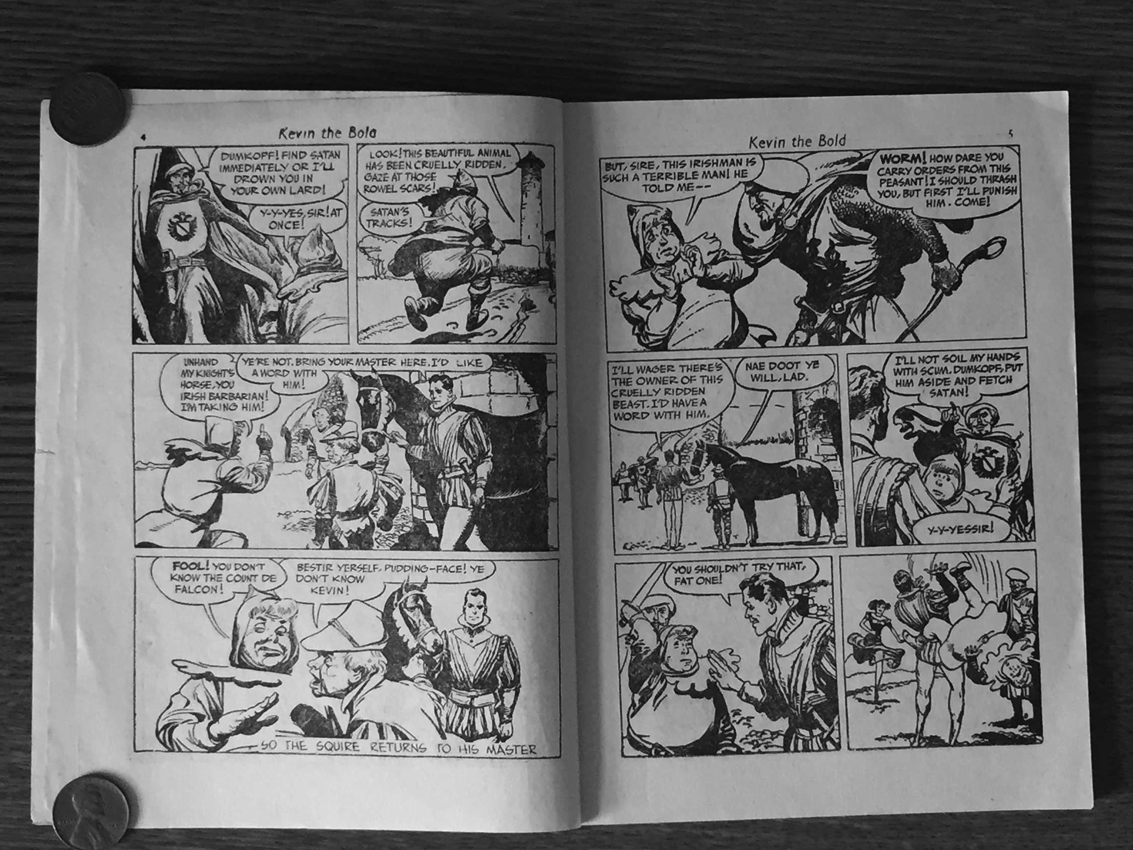
The only previous time the comic strip’s logo changed was on April 23, 1961. Ten years into its run, the familiar blocky KEVIN logo adorned with a claymore and shield was replaced by a more elegant version featuring new weapons and an uncial-style font more appropriate for an Irishman. In fact, in its final appearance in print, the old logo is half-obscured by an enormous Spanish galleon, a portent of its imminent departure. The new logo coincided with the onset of Jay Heavilin‘s 13-month stint as writer for the comic strip.

KTB 042361 TH 150 QCC.jpg

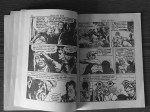
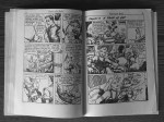
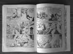
Yes, those are balls of cheese being used for ammunition!

KTB 043061 TH 150 QCC.jpg

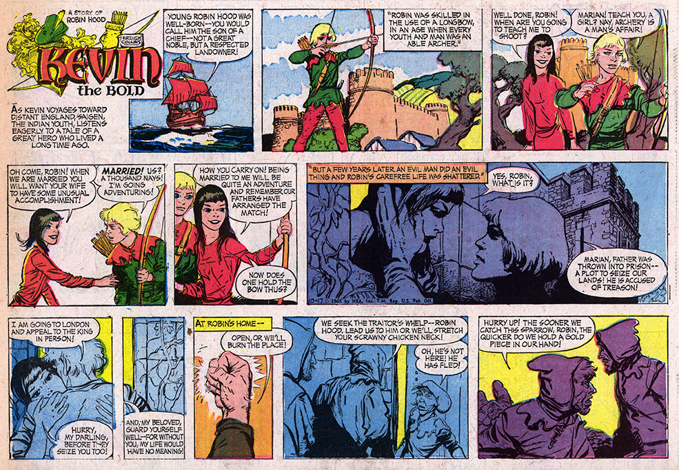
A year later, the logo was modified again, this time just by adding the new chapter’s title, “Story of the Norman Conquest.” While the historical timeline  in “Kevin the Bold” can be a bit difficult to follow—the first episode takes place at the end of the 15th century while the final one is dated 1668, about 175 years later—setting the action during the Norman Invasion of Ireland (c. 1170) required a different approach. Here Kevin’s ancestor (also named Kevin) is featured. Making this flashback less confusing to casual readers, the two Kevins appear identical, except for the ancestor being blond.

KTB 111366 HA 150 qcc.jpg

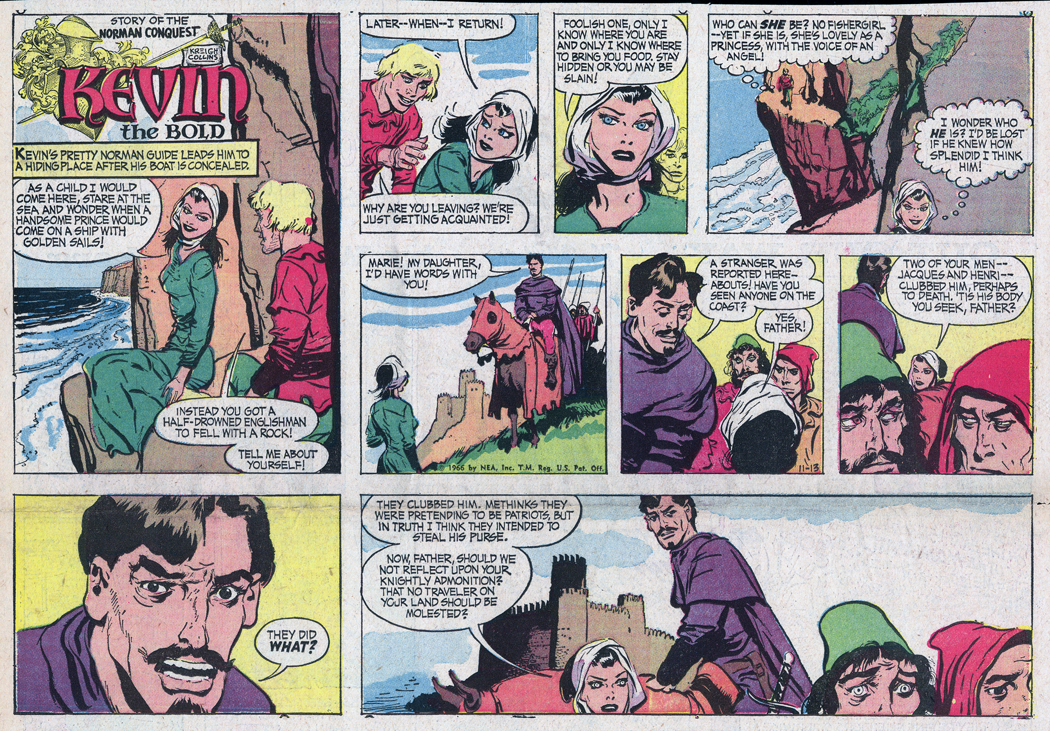
Another point of departure is the ancestor’s willingness to chase after women, something later-day Kevin eschews. However, the episode that ran two weeks later portrays the two Kevins as essentially the same character.

KTB 112766 HA 150 2 qcc.jpg

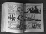
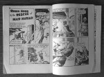
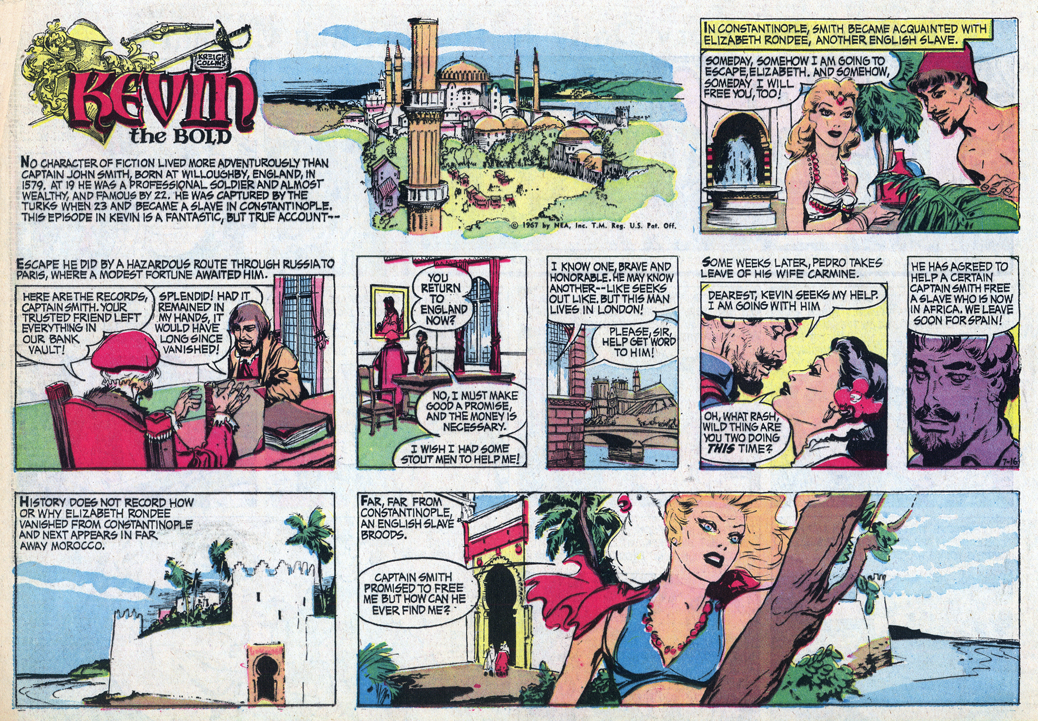
The final time the comic strip’s logo was altered was for one its last sequences, “A True Story of Captain John Smith.” Following this chapter, only four more appeared before the comic strip morphed into Kreigh Collins’ final NEA feature, “Up Anchor!”

Oddly, the July 16 episode introducing the sequence is not labelled as “A True Story of Captain John Smith,” but the 14 comics that follow are. Perhaps adding the title was a late decision made by the NEA, and the fact that it is typeset, rather than hand-lettered, lends credence to the theory.

KTB 071667 HA 150 qcc.jpg

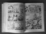
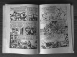
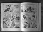
Another familiar trope is the damselle in distress! Not that I’m complaining, mind you.

KTB 1967 07.23 qcc

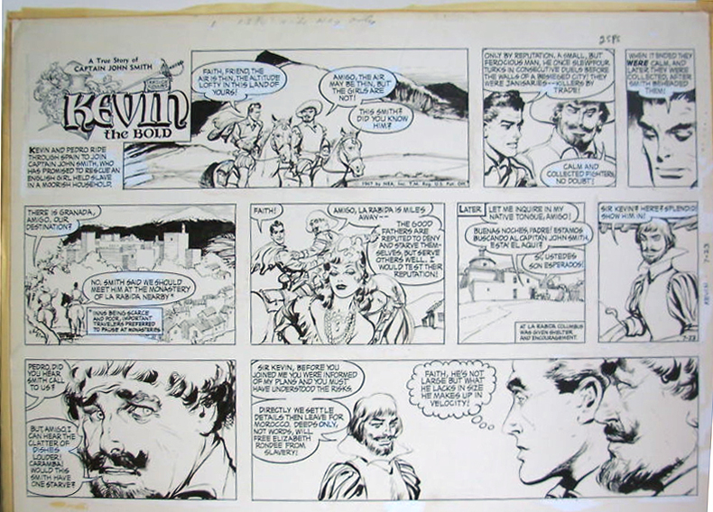
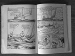
Nearly all the original art for the final three years of KEVIN THE BOLD  is found in a collection at Syracuse University. The July 23 episode is an exception. (I found this image online).

KTB 073067 HA 150 qcc.jpg


How Many Different Logos Were Featured in MITZI McCOY?

That question and more can be answered by picking up a copy of “The Lost Art of Kreigh Collins, Vol. 1: The Complete Mitzi McCoy.” It features a wonderful introductory essay by Eisner Award-winner Frank M. Young and is available here.

Mitzi cover final


For more information on the career of Kreigh Collins, visit his page on Facebook.

Thriller Comics No. 24


Only 5-1/4″ wide by 7″ tall, Thriller Comics No. 24 is smaller than other Australian edition comic books I’ve seen (below)—they have a trim size of 6-3/4″ x 10″. But as MacTavish Campbell MacGregor (shown training with Kevin on the cover) would be the first to tell you, sometimes big things come in small packages.

Thriller Comics No. 24 was printed in London, England c. 1951, and marketed in Australia. The cover lists its price as “1’–” which I’ve just learned is one shilling (thank you to my wife’s Australian cousin Lorrie!). It contains two classic early sequences, “The Count de Falcon” and “The Search for Sadea;” combined, they ran over a period of 33 weeks. These 33 episodes are split into five chapters and jammed into 59 pages. I say “jammed” because the comics are abridged—as many as three of the original panels are excised from each episode (not even including the throwaway panels!). In some cases, the panels’ order is changed as well, in an attempt to help streamline the flow of action.

The final three spreads of the comic book feature a Robin Hood comic by an unknown artist (Kreigh Collins isn’t credited for “Kevin,” either), leaving me to wish the comic book editors hadn’t bothered with Robin and had ran the “Kevin” episodes in their entirety.

This is a very minor nit to pick, as the Thriller Comics No. 24 is awesome. My copy is kind of fragile — I didn’t want to damage it by flattening it in my scanner, so I took some quick photos of it with my phone. Here is Chapter 1. 

KTB TC No. 24 C2-01.JPG

KTB TC No. 24 02-03.JPG

ktb tc no. 24 04-05ktb tc no. 24 06-07ktb tc no. 24 08-09ktb tc no. 24 10-11ktb tc no. 24 12-13

(If these photographs aren’t satisfying, the sequence’s original, color Sunday comics can be seen here). The story continues with chapter two…  

Here’s Chapter 3, which I call “The Search for Sadea,” and whose original comics  can be seen here.

Chapter 4:

And the conclusion, Chapter 5. An avid sailor, my grandfather clearly loved drawing boats of any size in his comics. In addition to “Kevin the Bold,” boats were featured frequently in both “Mitzi McCoy” and “Up Anchor!”

In October, 1965, near the end of the line for “Kevin the Bold,” Kreigh Collins also used Robin Hood in a plot. Here is another cartoonist’s take on Robin. 

And finally, the back cover.

ktb tc no. 24 c4


For more information on the career of Kreigh Collins, visit his page on Facebook.