Kevin vs. the Spanish Armada, Part I

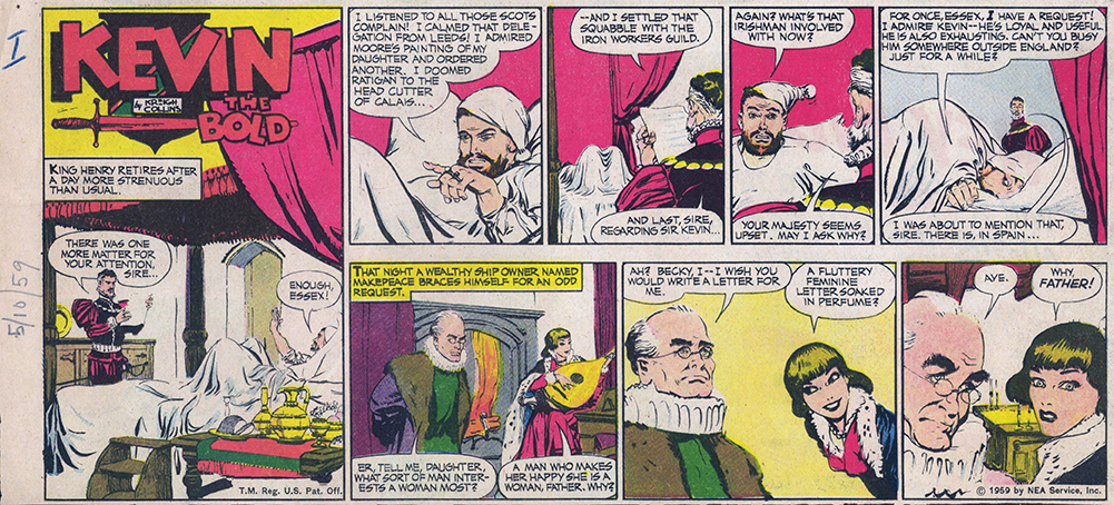
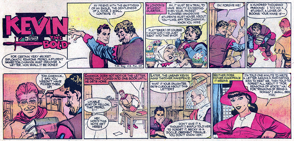
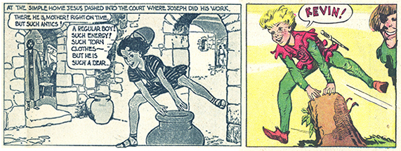
Kreigh’s NEA-syndicated comics, “Mitzi McCoy,” “Kevin the Bold” and “Up Anchor” each ran as serials. The individual storylines could be as short as six episodes, such as in “Mitzi,” or much longer, as was often the case with “Kevin.” The next few posts will feature a storyline from “Kevin” that ran from May to September, about halfway through the 18-year run of the comic. Unfortunately, these comics are third-pagers, but the story is highly entertaining. The first episode, from May 10, 1959 serves as the transition from the previous storyline to the new one.

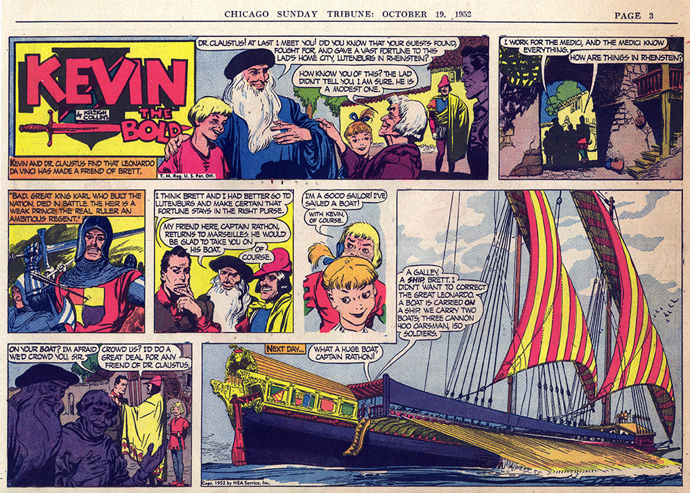
The original comics are in decent shape, but they are rather yellowed due to exposure to sunlight (the mortal enemy of newsprint). The reason for this yellowing is that they came from Kreigh’s studio — they had been pinned up on the walls to allow him to keep track of continuity. (Note pinholes and Roman numeral “I” on the May 10 comic). The first three comics appear to be from the Detroit News, and the fourth one is from the Chicago Sunday Tribune, which generally had superior color reproductions.

I gave them a quick color correction to sharpen them up. Check in again next week as the story continues…

KTB 051059 TH 72 cc

KTB 051759 TH 72 cc

KTB 052459 TH 72 cc

KTB 053159 TH 72 cc

Sunday Comic Formats

KTB 102757 HF 72 QCC

Common formats for Sunday strips include the half page, the one-third page, the tabloid page, and the half-tab. Usually, only the half-page format is complete, with the other formats dropping or cropping one or more panels. Such “throwaway” panels often contain material that is not vital to the main part of the strip. Collectors generally value half pages the most, since the other formats are incomplete by comparison. Half-tabs have approximately the same aspect ratio as half-page comics, so while their printed size is quite small (10″ x 7″ vs. 14″ x 10″ for half-pages), at least the reader sees all of the artwork. The half-page version of the October 27, 1957 episode of “Kevin the Bold” is shown above.

When Kreigh’s comics appeared in tabloid papers, the small center panel was generally the throwaway. When they appeared as one-third pages, severe cropping could occur (in addition to losing the throwaway panel). The storyline would continue but the impact of the comic was lessened.

Below are tabloid and third-page versions of the same comic. In this case, Black Llewellyn’s scowl is the throwaway. Too bad! And in the third-pager, each panel is cropped both left and right.

KTB 102757 TA 72 QCC KTB 102757 TH 72 QCC

At bottom, examples of the “Kevin” that ran on October 19, 1952 show an even more unfortunate example of the cropping that could occur. (This strip also has an appearance by Leonardo Da Vinci. Leonardo would also show up toward the end of “Kevin” ’s run, in 1967).

KTB 101952 HF 72 QCC

KTB 101952 TH 72 qcc

In the Beginning

031046 StLP-D Ad 72

Before creating his NEA-syndicated comics, Kreigh Collins took all sorts of painting and illustration commissions; he also wrote and illustrated books. He found steady illustration work with religious publishers, including Pilgrim Press (“These Men Knew God,” from 1947), the Fideler Company (1948’s “Bible Days”) and The Graded Press (“The Story in the Bible,” 1949), among others. For Nashville’s Methodist Publishing House, he did comics which were reproduced in Sunday School brochures called “Boys Today” and “Girls Today.”

Comic-strip technique was being applied to religious stories in a new way in order to increase their appeal to children. The Methodist Church’s board of education declared this pictorial way of telling Bible stories a great success, and approximately 700,000 copies of the stories were circulated each week. Chapters often ended with suspense questions of the “what will happen next?” variety.

An item in the March 10, 1946 St. Louis Post-Dispatch (top) described the phenomenon and featured several of Kreigh’s comics. The blurb said that Collins had “visited the Holy Land to add authenticity to his work,” but it is more likely the authenticity was provided by hundreds of hours spend doing research at local libraries.

BPS The Boy Jesus 72

These early comics showed examples of Kreigh’s style and devices he would employ throughout his career. Note the distinctive lettering, the use of descriptive inset illustrations (above, a phylactery; below, a quintain), and even Jesus’s pose, as he leapfrogs the vase (compare to Brett, at bottom, from a 1955 Kevin).

KTB 050353 HF 72 QCC

Leapfrog

Kevin the Bold

KTB 011655 HF 72 cc

One day at work, about a dozen years ago, I was asked if I could reprint a comic book cover (I worked in the art department, so we had the color printers). My co-worker collected comic books and he had bought one whose cover was missing. I mentioned how my grandfather had illustrated comics and the conversation led to where I could find used comics for sale. A week later, I was the proud owner of 105 “Kevin the Bold” half pages, 1955-56 complete, a great start to my collection. Unfortunately, they were from the Florida Times Union, a paper with poor-quality printing. Nonetheless, I was on my way. “Only” 838 more to go before I had the entire run.

Above, a half-page from January 16, 1955.

Introducing Mitzi McCoy

MM 110748 72 cc wbg

Kreigh Collins’s first comic strip was “Mitzi McCoy.” It premiered on November 7, 1948. Mitzi’s debut was appropriately dramatic — beautiful illustration and a runaway bride. This half-page ran in the Indianapolis Times. Collins obviously put a lot of time into the artwork, and the Times invested a lot of effort in a getting it to print so nicely. Cyan was used in addition to black for the speech balloons and most of the line work to create very rich blacks, and the registration is perfect, resulting in a nice crisp comic.  

Along with Mitzi, the strip’s other two main characters (Stub Goodman and Tim Graham) were introduced, and I don’t think we’ve seen the last of that scoundrel Phil Rathbone.