Tom Mix Nr. 4 (1953)

For a while, it seemed like the results of last week’s survey would be unanimous, but a late flurry of vote (singular intended—Ed.) made things interesting. As I was color-correcting the pages of what was Rafa G’s request, TOM MIX Nr. 4, a second vote came in from Alberto, tying the score. With no tie-breaker in place, a New York Mirror Sunday comics section will have to wait until next month.

Although my ruse didn’t produce an overwhelming response, it was nice to hear from a few readers. As for the third request I received (thanks, Roger!), the Treasure Hunt chapter will begin next week.

Like the preceding issues, the cover for TOM MIX Nr. 4 was printed in color on a nice, sturdy cover stock, with black and white inside covers. Released two weeks after its predecessor, the cover seems to feature General George Custer. (I might be missing something, but I didn’t find this character inside the comic book). Besides the cachet of being a nicely printed, 70-year old comic featuring the Swedish version of KEVIN THE BOLD, it features a few other elements that coincidentally align with some of my (other) fondest obsessions—the Buffalo Bills, beer, and Johnny Cash.

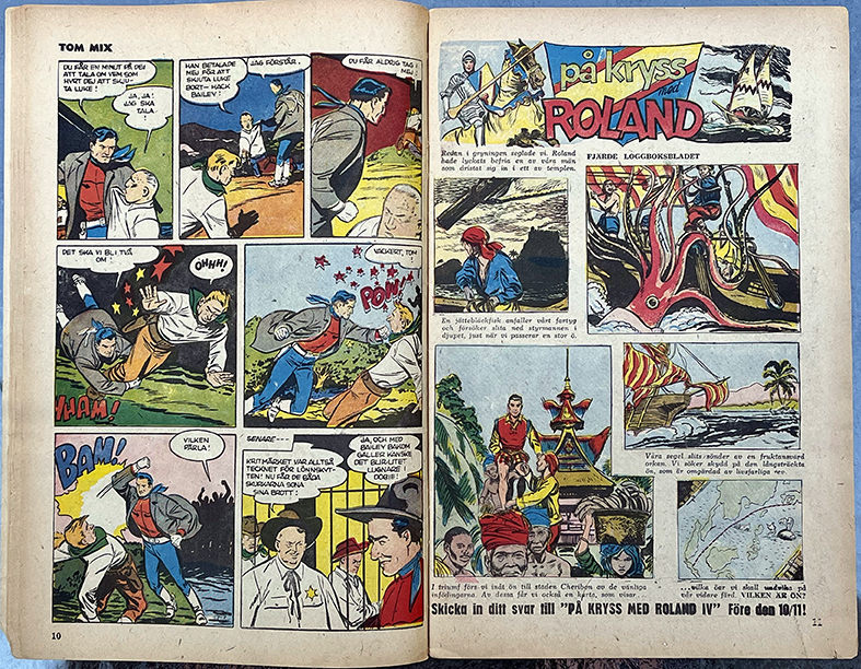
As usual, two episodes of UGH appeared on the inside front cover. The main portion of the comic book was kicked off by a mock-up of a newspaper’s front page.

TOM MIX runs across three spreads…

…and concludes on a page facing the recurring På Kryss med Roland contest, notable for its imagined adventures, this time featuring a giant squid on the attack.
De Dog Med Stövlama På (“They Died with their Boots On”) follows; it profiles “Wild” Bill Hickok, the notorious gun-fighting western figure.

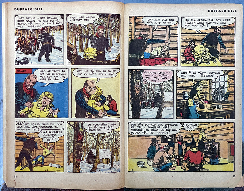
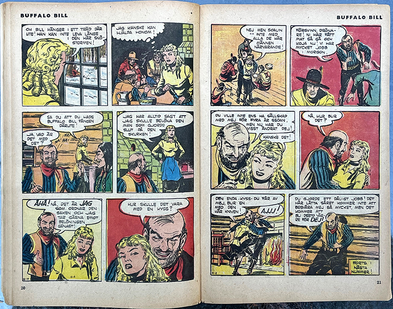
Eight pages of a comic based on the exploits of William F. “Buffalo Bill” Cody followed. Interestingly enough, “Wild” Bill Hickok and Buffalo Bill knew each other—in fact, Hickok became Cody’s mentor.

Two Bills—“WIld” (left) and “Buffalo” (right).

I’m not overly familiar with either of these Bills, but having grown up in western New York State, I’m a big fan of the (American) football team, the Buffalo Bills!

Next up was ROLAND DEN DJÄRVE. The action picks up where it left off in TOM MIX Nr. 3, with the episode originally published on December 24, 1950. The comic book publisher created their own color separations, and an interesting choice was made for the color of Roland’s hair—he’s blond (not the first time Kevin was depicted as a toehead).
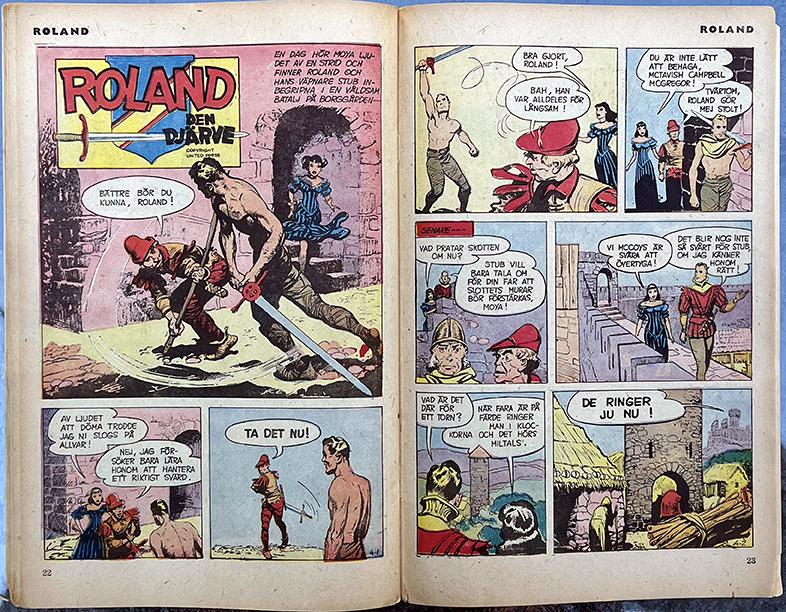
To fit in the comic book, the three Sunday half pages were repurposed quite smartly, with each episode being reconfigured into a comic book spread.

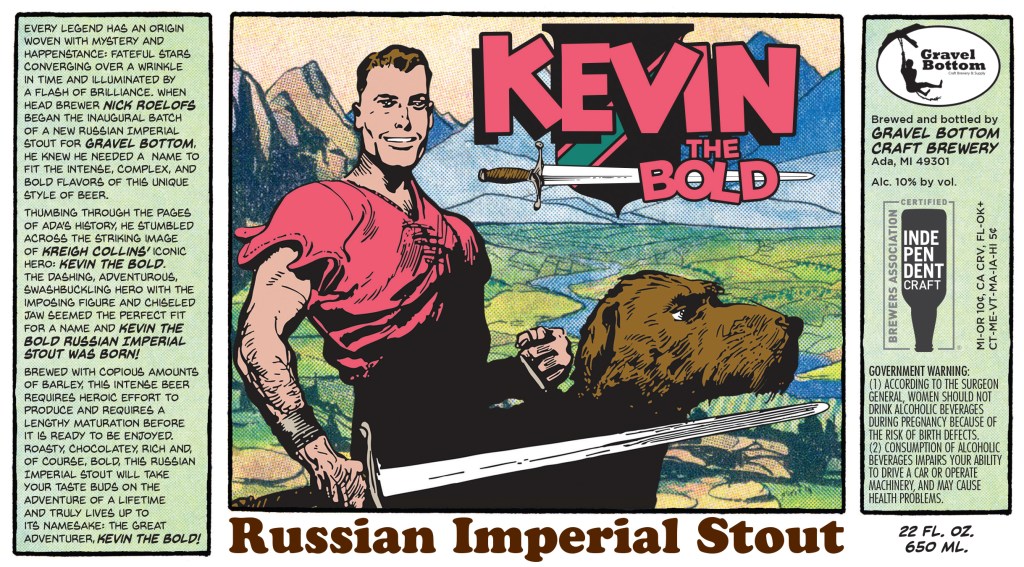
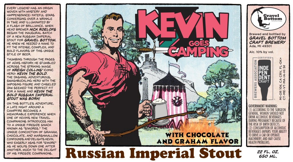
As a Buffalo Bills fan, it might come as no surprise that I’m also a fan of beer; I used the little tent seen in the introductory panel of the December 31 episode as part of a beer label I created for Ada, Michigan’s Gravel Bottom Brewery—Kevin the Bold Imperial Stout.
Following Kevin, it’s time for LASH LaRUE.

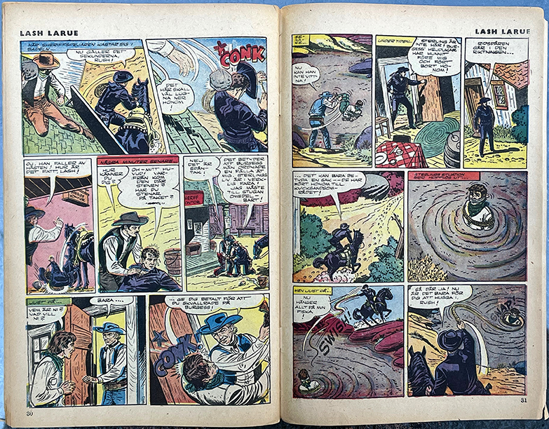
My only familiarity with Lash LaRue is the fact that he appeared on the cover of a mid-1980s album by another of my obsessions, Johnny Cash. (Before I started collecting my grandfather’s comics, I collected Johnny Cash LPs. I don’t have them all, but 94 is a pretty substantial total—even without including CDs and cassette tapes, but I digress). The handsomely-photographed album features an action shot of Mr. LaRue on the back cover. (Sadly, the version of “Heroes” that appears at the end of side one is not a cover of David Bowie’s memorable track).
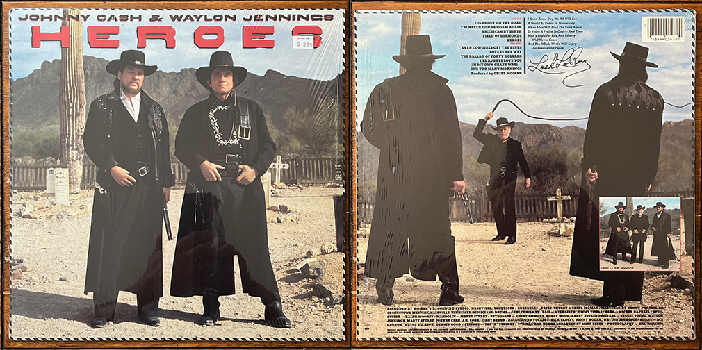
No offense to Johnny or Waylon, but the cover art is the album’s highlight. Getting back to the realm of comics, it’s interesting to know that Johnny even had his own comic book.

TOM MIX Nr. 4 concludes with a short story running on the inside back cover, Afrikas Vän (“Africa’s Friend”), about David Livingstone.
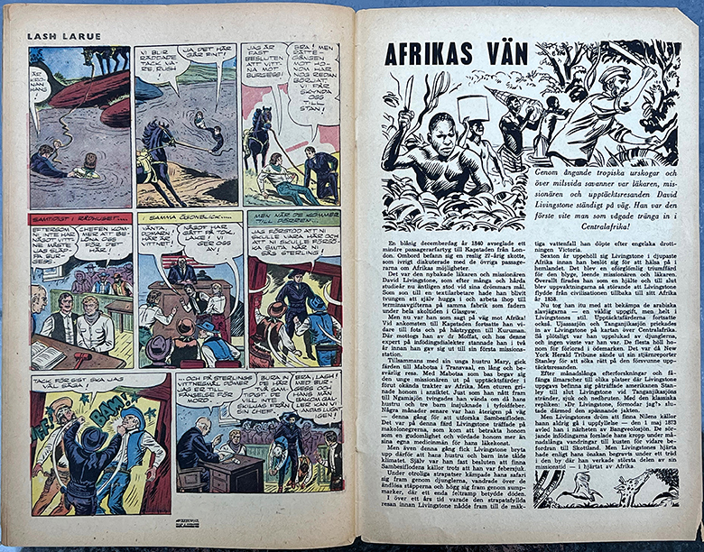
Despite owning a book on Livingstone written and illustrated by Kreigh Colllins (1961), my knowledge of the famed explorer was quite spotty. (I was happy to learn that he was an abolitionist, and not out to exploit Africa).

Livingstone’s portrait is featured on the back cover of TOM MIX Nr. 4.

Thanks again to those who voted last week.

_______________________________________________________________

For more information on the career of Kreigh Collins, visit his page on Facebook.

Separations, but not Equal

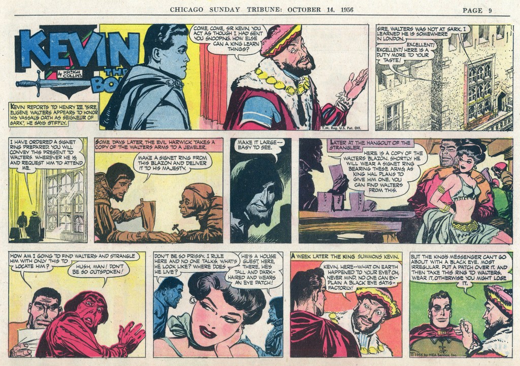
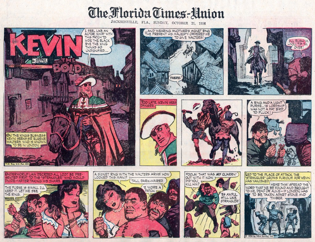
Little does Kevin know that his unexplained black eye will lead to worse circumstances.

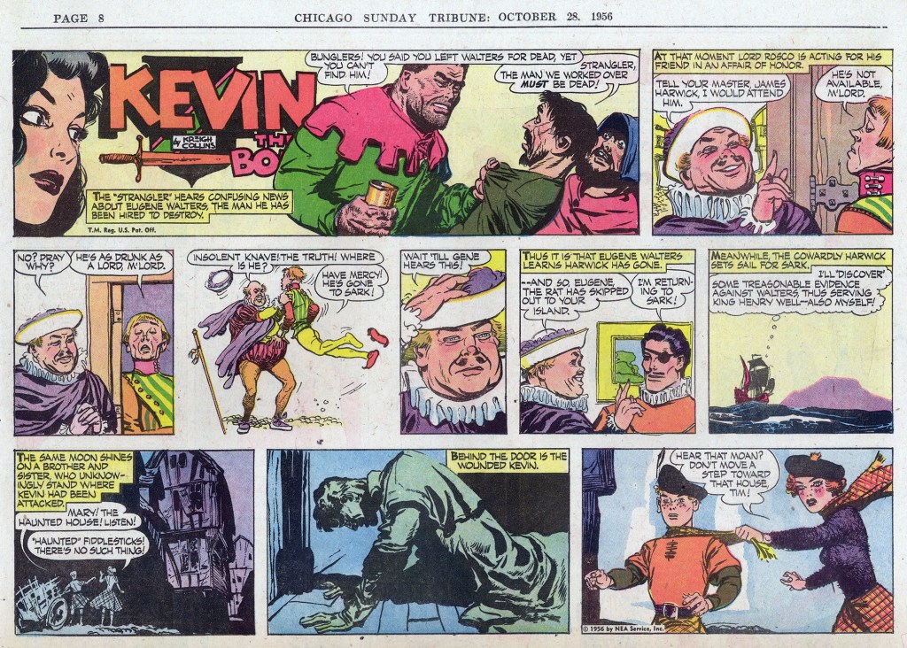
As far as this particular story arc goes, one definite bonus is the fact that I have Chicago Tribune examples of each episode. While the paper was long past its heyday of incredible color separations and reproduction—some “Kevin the Bold” episodes from the early 1950s are simply stunning—the paper still created its own printing plates, which led to higher-quality final results.

Comparing an episode from the Trib with one from the Florida Times-Union could be seen as comparing apples to oranges, with the latter’s output often being rather magenta-saturated, a close comparison between the two shows that the Tribune did indeed use different printing plates than those offered by NEA Services to its regular subscribing newspapers. In some panels it is hard to determine if the difference was simply due to the flood of magenta ink and indifferent press operators, but in the Trib‘s splash panel, the lower portion of Kevin’s cloak clearly shows shades of both orange and red, while in the Times-Union version it’s all reddish orange.

It’s a shame that raven-haired Gertie has gotten mixed up with the Strangler, she’s generally my favorite part of any episode in which she appears!

To be continued…

___________________________________________________________________________________

For more information on the career of Kreigh Collins, visit his page on Facebook.

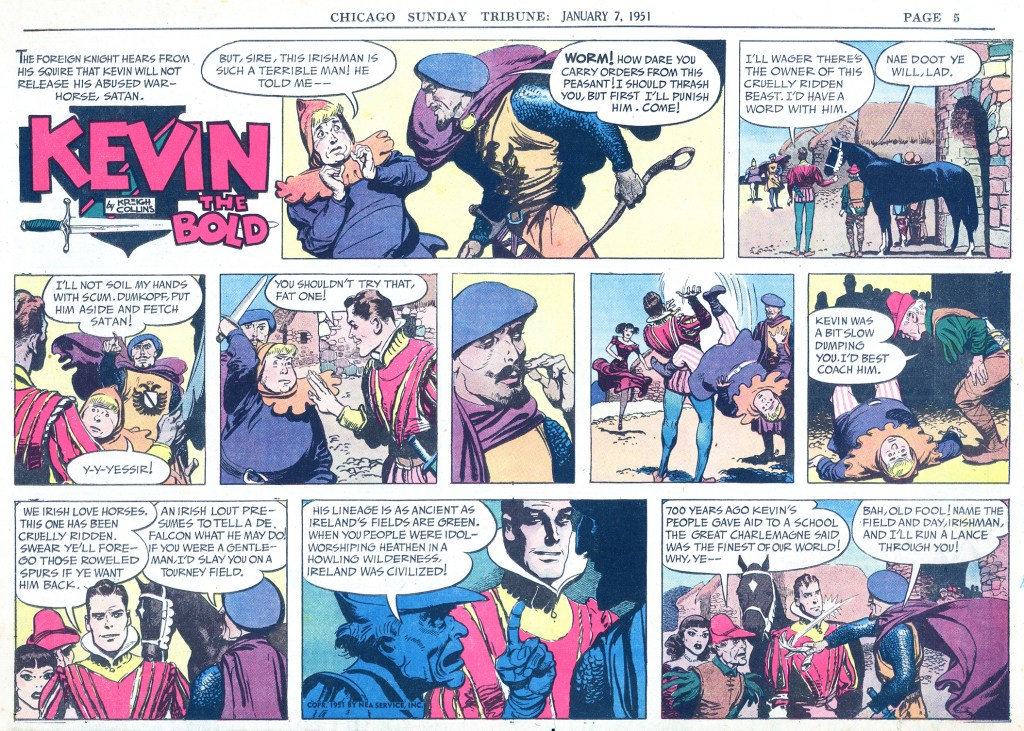
Ippon!

When I was a lad, I joined a judo team and took lessons for several years. We learned a bit about Japanese culture and a little bit of the language (I still remember how to count to 99). I got a start at a young age, and did pretty well. I loved it.

To win a match, as I recall, you basically needed to score one point. A nice throw might earn a half point (wasa-ari), and if you achieved two nice throws, it was enough to win. A quicker path to winning was to flip your opponent with a more or less perfect throw, and the referee would call “Ippon!“—meaning one point (and game over). I did this once, I can still remember my opponent coming at me, forcing me to retreat, until I spun and unleashed my bread-and-butter throw, the seoi nage.

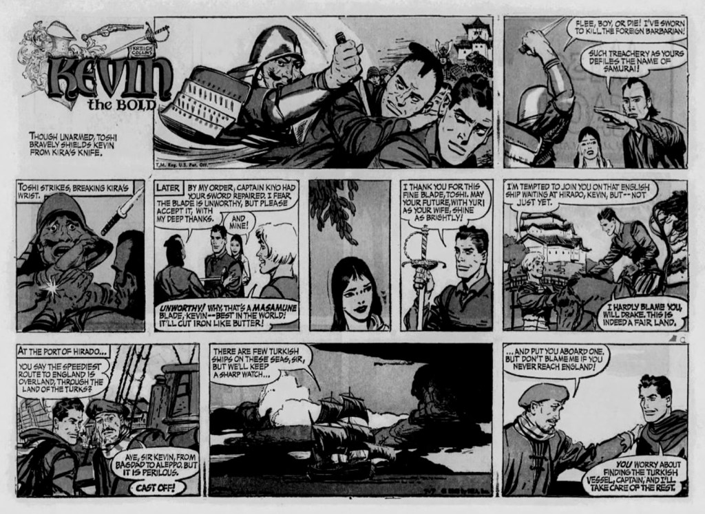
I only mention this because I thought there were three more episodes in this story arc, when there is in fact only one. And while the blow Toshi delivers is nothing like anything found in Judo (outside of an Austin Powers movie, maybe), it causes a sudden, decisive ending to the fight.

Definitely ippon.

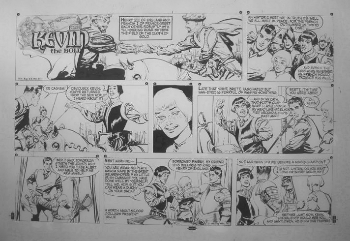
It’s unfortunate that I don’t have an actual copy of this concluding episode, and it looks like it may contain a pice of clip art—a photostat of Kevin’s sword, appearing in the panel after the throwaway. This time-saving device was used by Collins somewhat frequently during this period.

In this piece of original art from my collection (June 17, 1962), Brett is holding onto a photostat of Kevin’s sword (bottom left panel).

___________________________________________________________________________________

It’s 5:00 Somewhere

Since this was such a short post, let me fill some space with a recent photo of a special beer tasting.

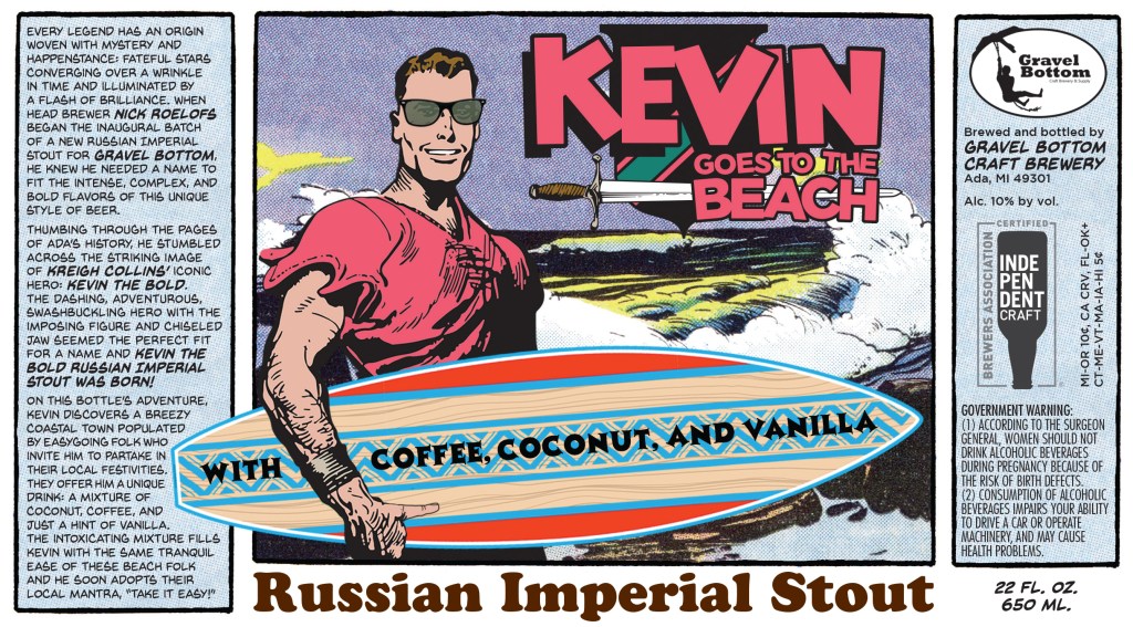
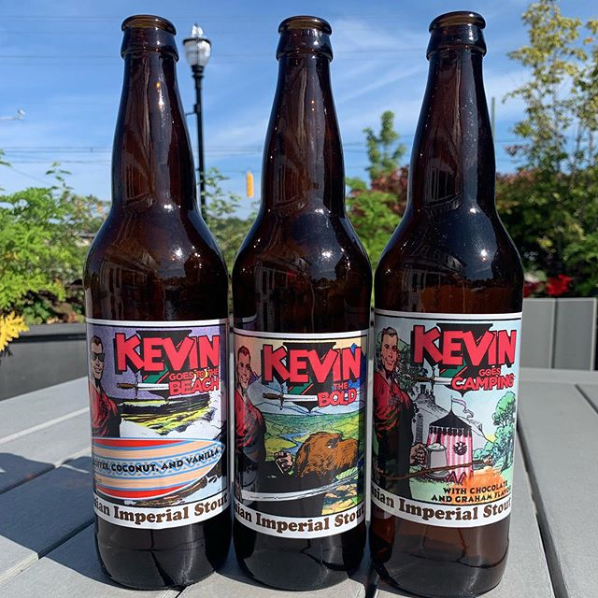
I wrote about these beers last November. I provided customized label artwork for a brewery in my grandfather’s old hometown—Ada, Michigan’s Gravel Bottom Brewery—and the brewery produced three varieties as their first bottle releases. I had previously tasted the base version (Kevin the Bold Russian Imperial Stout), and it was quite nice, but I think I preferred a version that I’d cellared for the last year, “Kevin Goes to the Beach,” with its subtle coffee, coconut, and vanilla flavorings. Aging it really helped. Later in the winter, I’ll surely be cracking open the last one, “Kevin Goes Camping.”

___________________________________________________________________________________

For more information on the career of Kreigh Collins, visit his page on Facebook.

Hey Bartender!

If you’re reading this on November 7, Happy International Stout Day!


Following the lengthy story of Kevin, Rupert, and Madeline, here is something of a palate cleanser. Presenting… Kevin the Bold Imperial Stout. It’s debatable how well a rich, heavy brew like this would work as an entremet, but until someone comes up with a Mitzi McCoy Blonde Lager, this will have to do.

3 KTB Beer Bottles.jpg

For most of his life, Kreigh Collins called Ada, Michigan, his home and it is only fitting that the beer was produced by Ada’s Gravel Bottom Craft Brewery.

Three varieties were produced to celebrate the company’s sixth anniversary. Using both original comic strip art and scanned newspaper comics, I worked with head brewer Nick Roelofs in designing the labels, and I’m pleased with the results.


The base version of the beer (“Kevin the Bold”) is a barrel-aged Russian Imperial Stout, and the other two have added flavorings. “Kevin Goes to the Beach” uses coffee, coconut, and vanilla, and “Kevin Goes Camping” has a “smores” theme, and uses chocolate and graham flavor. These were the first bottled beers that Gravel Bottom has released.

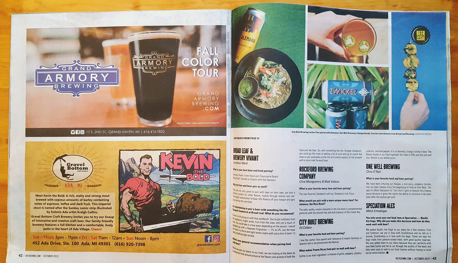
I searched through my library of comics to find images that coordinated with the beer varieties, and paired them with the recurring image of Kevin. Initially, Gravel Bottom was going to make T-shirts with the bottle artwork—unfortunately, this idea has been moved to the back burner. However, the brewery has featured the artwork in some of their advertising.

KTB Mag Ad IMG_1773.jpg

I have yet to taste the beer (I’m hoping they are still holding the bottles they promised me), but others seem to like it, according to online beer reviewing sites.


Gravel Bottom Brewery’s website is at gravelbottom.com


For more information on the career of Kreigh Collins, visit his page on Facebook.